
A little bit about our logo and why it looks as it does!

Quite a few people, and especially those from outside the food industry, ask us about the logo and how it came about. Those in the food industry, particularly those involved in HACCP food safety and QA get it, but it can be a bit too ‘off beat’ for those not so deeply involved with food safety.
For the uninitiated, all HACCP based food safety programmes that operate in food facilities are supported by a food safety plan which, in its development, has seen a mapping of all the processes in the manufacture and handling of the food and beverage products that make their way to the shops, restaurants or food outlets. That mapping requires a HACCP flowchart and within that flow chart one will find the employment of five HACCP symbols, they being the five components of our logo – the triangle, the ‘D’, the circle, the arrow and a square (being the outer shape in the mark).
These symbols represent the actions that might be applied to a food product or ingredient as it moves through the process. These diagrams are commonly referred to as ‘HACCP flowcharts’
The 5 symbols are used as follows :
![]()
Depending upon the complexity of the operation, there might be quite a number of these. A typical flowchart of might look like this:
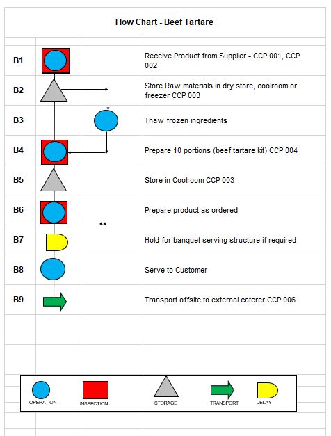
So, there you have it – the five symbols all in use in the flowchart – and the five symbols that combined to make our logo!